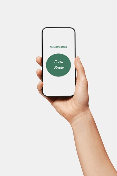
Green Palate
Personal Project
Research / Branding / UX / UI
Figma / Adobe CC
Mobile / Desktop
Problem
Users are actively seeking convenient and health-conscious food delivery solutions to free up their time from cooking, allowing them to prioritize what truly matters to them.
Solution
Through the development of a nutrition-driven app that seamlessly integrates into daily routines, individuals gain the power to make informed decisions that positively impact their lives.
Deliverables
1 month worth of initial research.
Brand identity & applications.
Interactive desktop & mobile app prototypes.
Usability tests were conducted with diverse users.
Project started in November 2023

Research
I conducted extensive interviews with a diverse range of users in Canada to gain deep insights into their interactions with fast-food delivery apps. I aimed to uncover the ideal app experience from their unique perspectives, considering both limitations and accessibility requirements. While initially assuming common needs among participants, my research revealed varying motivations that drive user engagement.
To better understand how I could create the most innovative food delivery app on the market, I mapped out the user experience through a storyboard, analyzed competitors to discover design opportunities, and created a mood board as a design compass.

Pain Points
1
Some apps don’t have accurate wait times and do not offer reliable customer service.
2
Users are concerned about visual impairments.
3
Users want healthy food options and transparency.
4
Users desire seamless and uninterrupted access to ordering, ensuring a hassle-free and convenient experience.
Persona

Jessica is a 21-year-old part-time waitress and busy student living in NYC.
Jessica Leaf
”
I’m usually running around the city between classes and work. I barely have enough time to cook as is. There are a lot of options for food delivery, but I’m looking for the healthiest option available
Daily Life
Attends classes Monday-Friday during the day and works in the evenings.
Studies in between work and school at local cafes and libraries.
Loves to have social outings with friends on the weekend
Challenges
Sharing a communal kitchen with roommates and having to cook on a daily basis
Balancing school, work, and social life
Plethora of food delivery, but hard to find a healthy options
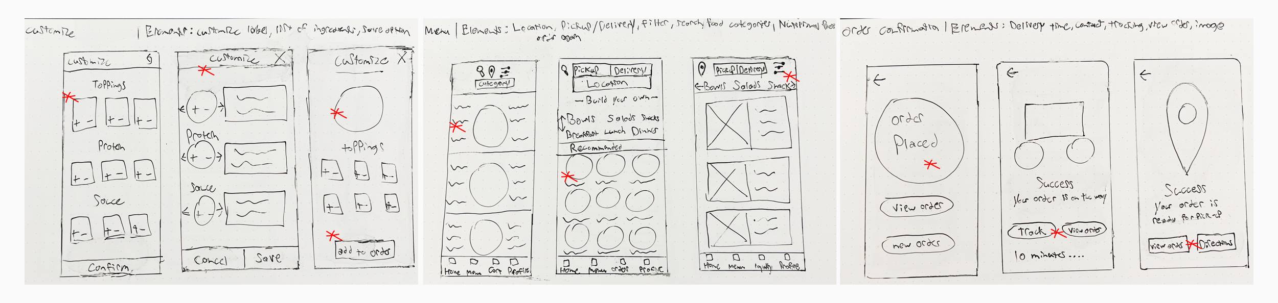
Ideation
Drawing inspiration from competitor flaws, I meticulously developed multiple iterations for each app screen on paper. This ensured that the features transitioning to digital wireframes effectively addressed user pain points.
By establishing user flows, I could effectively organize the sequence of low-fidelity screens, with the goal of enhancing user experience and maximizing efficiency. Journey mapping provided an in-depth user-centric perspective of a standard ordering process that can greatly be improved upon.
After completing all the paper wireframes, I digitized them with the intention of conducting a usability test after finalizing the prototyping phase. My aim was to simplify navigation as much as possible at this stage of the design process, laying the foundation for more functional screens.


Iteration
Through a series of 30-minute unmonitored usability tests, users were asked to complete specific user flows in a low-fidelity model and participated in a debrief via Facetime afterward. Results were synthesized and analyzed for recurring trends. The following points were uncovered:
Users want to order quickly.
Users want a faster way to access the cart.
Users want a favoriting feature.
Users want a rating system.
Users want health app functionality.
The mobile-first design was the starting point that led to a responsive desktop + mobile experience. Using the feedback from the usability study, I:
Simplified navigation by adding a cart icon to the top right of applicable screens.
Added a search icon to the top right of the home screen and across all desktop screens.
Added a rating to all menu items so users could make an informed choice.
Added an exclusive feature called ‘health sync’ where users can sync the nutritional macronutrients and calories of all their orders directly with their health app of choice - ‘MyFitnessPal’ or ‘Lose it!’
Added a full breakdown of ingredients and nutritional facts for menu items and past orders.
Added a ‘reorder’ button so users can add past orders directly to cart.
Contrast was analyzed according to the Adobe Color contrast checker to ensure easy readability
“I’ve never seen features like this in any other food delivery app”
- Usability tester #2


See it for yourself:
Mobile Prototype
Desktop Prototype

Outcomes
Reflection
Throughout the creation of this project, I acquired valuable insights into effectively catering to user needs, honing the development process through conducting my first usability test, and using synthesized data to navigate toward the ultimate refinement of an app.
I've come to appreciate the perpetual opportunity for enhancement within the food industry, recognizing that the most significant impact lies in crafting an app that delivers a distinctive experience to enhance the lives and health of its users.
Updates
Completed on January 14th, 2024.
Research on new trends in health.
Iteration continues into February.